 |
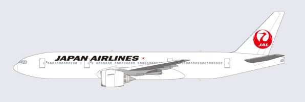
| JAL new livery with the old crane logo. Image by Japan Arilines. |
[Update: Added link to model plane with new livery at press conference]
Today at the anniversary of Japan Airlines (JAL) bankruptcy filing, JAL revealed its new logo and plane livery. The first plane with this livery will be a 767-300ER flying on international route (hey, YVR is downsizing to 763 when Summer schedule starts, which is around the same time frame!)
The JAL Group (JAL) today will adopt a new corporate policy and announced its decision to change its logo from April 1, 2011; symbolizing a fresh start for the airline group with its strengthened commitment to society and reinvigorated determination of the management and all employees.
...
The symbol of the crane has come to be associated with the nation’s distinct hallmarks of pristine quality and reliability. For customers, JAL is determined to safeguard these values of the Japanese culture and to continue reflecting its quintessential hospitality from the heart in the airline’s authentic services - a promise that is now embodied in the Group’s new corporate policy unveiled today.
..
The first aircraft to be painted with the new logo will be a Boeing 767-300ER for international flights. With the exception of staff uniforms which will remain unchanged, corporate items bearing the current logo such as signage, name tags and stationery will gradually be phased out over the next few years.
Any thoughts on the new livery? It looks just too white to me and might look dirty over time just like the pre-JAS merger livery :p
@ikarosairline has posted a picture of the model plane with the new livery on twitpic. You can find it here.
 |
| Old vs new logo |
 |
| New JAL logo. Image by @ikarosairline. |
Source: JAL Press Release


It's absolutely horrible! The typeface is bland and doesn't work with the logo or the aircraft and the bare white fuselage is painful to the eyes. They put a timeless logo back into their identity and ruined it with this effortless, empty livery.
ReplyDeletei agree its horrible! now i think garuda has the best livery
ReplyDeleteNo-one in their right mind could seriously say this is an improvement over the previous livery. One of the most retrograde steps since British Airways ditched the Landor livery for the current holiday airline look.
ReplyDelete